Gesture Animations
With the whileHover, whileTap, and whileDrag gesture animations, you can quickly make layers interactive. With just one line of code, you add an automatic animation between two states.
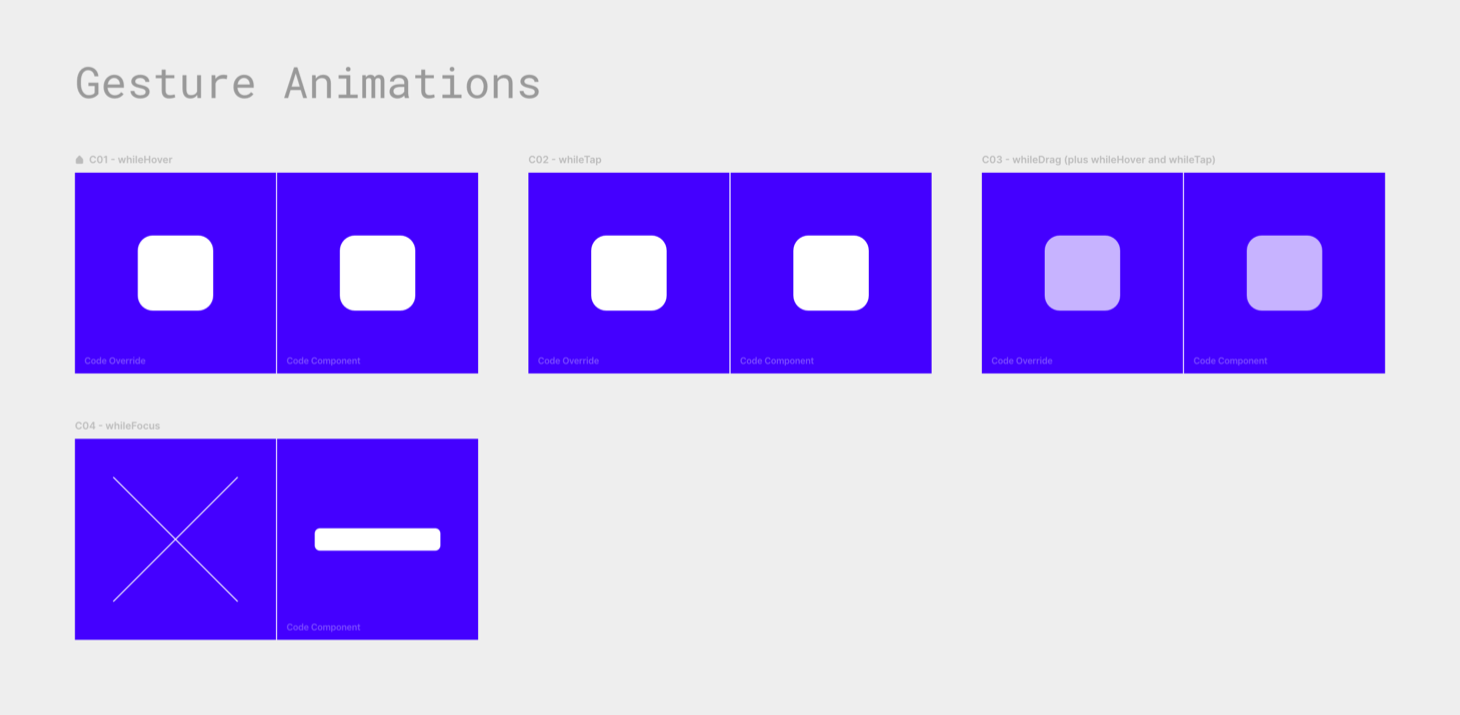
While Hover
Here’s an override example: You give animate.
export function WhileHover(Component): ComponentType {
    return (props) => {
        return <Component {...props} whileHover={{ scale: 0.8 }} />
    }
}
The frame shrinks to 80 percent of its size when you hover over
With one line of code, you’ve added two animations:
- one that happens when the pointer is over the frame;
- and a reverse animation that runs when the pointer leaves the frame.
While Tap
The second one, whileTap, works the same, but for tap gestures.
export function WhileTap(Component): ComponentType {
    return (props) => {
        return (
            <Component
                {...props}
                whileTap={{ scale: 0.8 }}
                transition={{ duration: 0.5 }}
            />
        )
    }
}And just like with animate, you can tweak these animations by adding transition settings. For example, here, the frame will take its sweet little time of half a second to shrink when you press down. And the same thing happens when you release; the grow animation also has a duration of 0.5.
While Drag
Framer Motion 3 added a whileDrag interaction. It works as you would expect.
Naturally, you can combine these gesture animations. Here we have a draggable frame with whileHover, whileTap, and whileDrag:
export function WhileDrag(Component): ComponentType {
    return (props) => {
        return (
            <Component
                {...props}
                drag
                whileHover={{ opacity: 1 }}
                whileTap={{
                    opacity: 1,
                    scale: 1.05,
                    boxShadow: "0px 5px 8px #037",
                }}
                whileDrag={{ scale: 1.1, boxShadow: "0px 10px 16px #037" }}
                transition={{ duration: 0.6 }}
            />
        )
    }
}whileHover— I gave the frame an opacity of 70% on the canvas, which changes to 100% when you hover over it.whileTap— Tapping the frame makes it grow slightly (scaleof 105%) and gives it a shadow.whileDrag— Once you start dragging, it seems to float a bit higher above the surface because of itsscaleof 110% and a largerboxShadow.
(The whileTap also changes the opacity to 1. This is for touch devices, on which a whileHover is not triggered.)
All three animations have a duration of 0.6 seconds, a bit longer than the default 0.3.
While Focus
Framer Motion 3.1 added whileFocus. Only HTML input elements can have a focus state, so you have to use a <motion.input>.
I tried to make something that’s impossible with CSS’s :focus pseudo-class and arrived at this crazy background animation that cycles through keyframes of different gradients.
export function C04WhileFocusFM() {
  return (
    <motion.input
      style={{
        // width, background, etc.
      }}
      whileFocus={{
        background: [
          "linear-gradient(to right, #f0f -200%, #0ff -100%, #f0f 0%, #0ff 100%)",
          "linear-gradient(to right, #f0f -100%, #0ff 0%, #f0f 100%, #0ff 200%)",
          "linear-gradient(to right, #f0f 0%, #0ff 100%, #f0f 200%, #0ff 300%)",
        ],
      }}
      transition={{
        background: {
          duration: 2,
          repeat: Infinity,
          ease: "linear",
          from:
            "linear-gradient(to right, #fff -200%, #fff -100%, #fff 0%, #fff 100%)",
        },
      }}
    />
  )
}(Apparently, adding the from value keeps it from continuing to animate (in Framer) when the input field has already lost focus.)
whileFocus with validation example
In the tweet announcing whileFocus, Matt Perry added this example that gives a visual indication of the field’s validation status:
- Blue: Neutral
- Green: Valid value entered
- Red: Invalid value entered (no spaces allowed!)
It has an onBlur() event (called when the element loses focus) that changes a validity state, which, in turn, defines which color is used for the boxShadow around the field.