The Animate Property
- Basic animation
- Animating a code component
- Transform properties
- Colors
- Complex values
- Which properties can you animate?
Basic animation
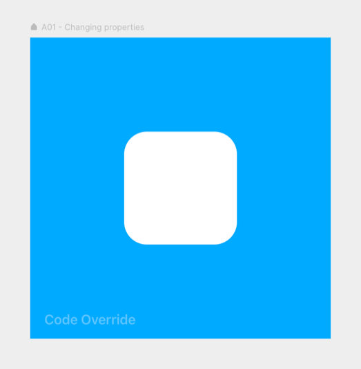
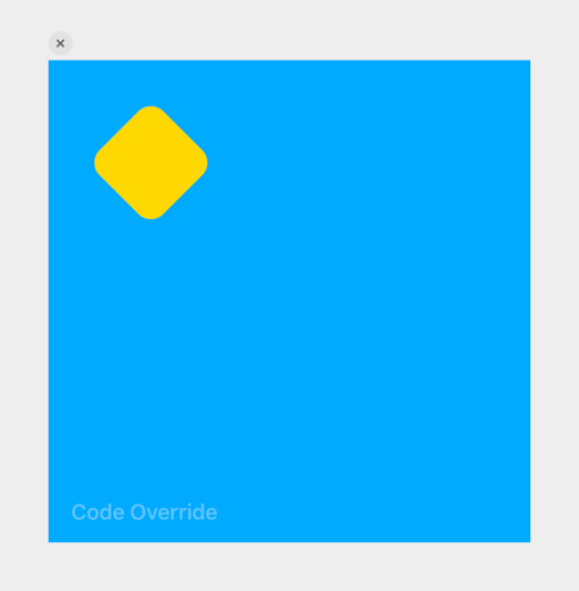
You already know that you can change a frame’s properties with a code override. For example, you can move, resize, rotate it, change its background color, or do all of it together:
export function Changing_properties(Component): ComponentType {
    return (props) => {
        const { style, ...rest } = props

        return (
            <Component
                {...rest}
                style={{
                    ...style,
                    left: 10,
                    top: 10,
                    scale: 0.5,
                    rotate: 45,
                    backgroundColor: "Gold",
                }}
            />
        )
    }
}

And this will happen instantly.
Well, the same thing happens when you pass those values to the animate property, only then… animated.
export function Animating_properties(Component): ComponentType {
    return (props) => {
        return (
            <Component
                {...props}
                animate={{
                    left: 10,
                    top: 10,
                    scale: 0.5,
                    rotate: 45,
                    backgroundColor: "#ffd700",
                }}
            />
        )
    }
}The result in the preview
Whenever you give animate new values, the frame will animate to those values.
Now, this animation happens immediately, the moment the frame becomes visible. But in the following pages, we’ll also look at how you can trigger it with an event.
Animating a code component
The above example is an override, but in a code component, this works the same:
export default function A02_Animating_properties(props) {
    return (
        <div
            style={{
                width: 400,
                height: 400,
                ...props.style,
                display: "flex",
                placeItems: "center",
                placeContent: "center",
            }}
        >
            <motion.div
                style={{
                    width: 150,
                    height: 150,
                    borderRadius: 30,
                    backgroundColor: "#fff",
                    position: "absolute",
                    left: 125,
                    top: 125,
                }}
                animate={{
                    left: 10,
                    top: 10,
                    scale: 0.5,
                    rotate: 45,
                    backgroundColor: "#ffd700",
                }}
            />
        </div>
    )
}
Obviously, there’s more code here because I’ve also had so set visual and positioning properties. So in upcoming code component examples, I’ll often only show the animation code, like this:
export default function A02_Animating_properties(props) {
    return (
        <div>
            <motion.div
                animate={{
                    left: 10,
                    top: 10,
                    scale: 0.5,
                    rotate: 45,
                    backgroundColor: "#ffd700",
                }}
            />
        </div>
    )
}
But you can always find the complete code in the example project.
Transform properties
Above I used the left and top properties to animate the frame’s position, but it’s actually better to use x and y for this. With these, what they call, transform properties, animations will run smoother (GPU accelerated).
They also have the advantage of starting from zero, so moving a frame 10 points to the right is as simple as x: 10. Other GPU-accelerated transform properties are: scale, scaleX, scaleY, rotate, rotateX, rotateY, skewX, and skewY.
export function Transform_properties(Component): ComponentType {
    return (props) => {
        return (
            <Component
                {...props}
                animate={{ scaleY: 0.5, scaleX: 2, skewX: -6, y: -120 }}
            />
        )
    }
}Transform origin
These transforms (scaling, rotating, and skewing) will happen from the frame’s transformation origin. By default, this is the center of the frame, but you can change that.
Here I placed the originY at the top of the frame so that the (x-axis) rotation happens with that edge as the center point.
export function Transform_origin(Component): ComponentType {
    return (props) => {
        const { style, ...rest } = props

        return (
            <Component
                {...rest}
                style={{ ...style, originY: 0 }}
                animate={{ rotateX: 360 }}
            />
        )
    }
}By the way, I applied some perspective to the frame’s parent to make the animation look three-dimensional:
export function Parent_frame(Component): ComponentType {
    return (props) => {
        const { style, ...rest } = props

        return <Component {...rest} style={{ ...style, perspective: 600 }} />
    }
}
Transform origin
transform-origin perspective
Colors
Just like you can change a frame’s backgroundColor, you can also animate it. As always, you write the color as a text string, in any of these CSS color formats:
- Hex Code — “#00ff00”
- Websafe Hex Code — “#0f0”
- RGB Decimal — “rgb(0, 255, 0)”
- RGBA Decimal — “rgba(0, 255, 0, 1)” (the last value is ‘alpha’)
- Hue Saturation Lightness — “hsl(120, 100%, 50%)”
- Hue Saturation Lightness Alpha — “hsla(120, 100%, 50%, 1)”
export function Color_Named(Component): ComponentType {
    return (props) => {
        return (
            <Component
                {...props}
                animate={{ backgroundColor: "#ff6347" }}
            />
        )
    }
}

export function Color_RGB(Component): ComponentType {
    return (props) => {
        return (
            <Component
                {...props}
                animate={{ backgroundColor: "rgba(153, 204, 102, 0.8)" }}
            />
        )
    }
}

export function Color_HSL(Component): ComponentType {
    return (props) => {
        return (
            <Component
                {...props}
                animate={{ backgroundColor: "hsl(290, 50%, 60%)" }}
            />
        )
    }
}You can also animate between different color formats, like from a HEX to an RGB value.
Pro tip: You can’t animate with CSS named colors like, e.g., “Tomato”.
Supported Values
background background-color
Complex values
Some CSS values are more complex. For example, a CSS boxShadow is also written as a string, but this string can contain the shadow’s x- and y-offset, blur, spread, and color.
You can animate all these values simultaneously if you stick to one kind of notation.
Take this code component example:
export default function A06_Complex_values(props) {
    return (
        <div>
            <motion.div
                style={{
                    width: 150,
                    height: 150,
                    borderRadius: 30,
                    backgroundColor: "#fff",
                    // Initial shadow
                    boxShadow: "0px -300px 80px 100px rgba(255, 255, 255, .3)",
                }}
                animate={{
                    backgroundColor: "#08f",
                    // Animation
                    boxShadow: "0px 0px 80px 30px #fff",
                }}
            />
        </div>
    )
}Its initial shadow (set on style) is:
"0px -300px 80px 100px rgba(255, 255, 255, .3)"Which stands for:
0px— x-offset-300px— y-offset80px— blur radius100px— spread,- and
rgba(255, 255, 255, .3)as the color.
… so I had to animate to a shadow defined with the same five values:
"0px 0px 80px 30px #fff"Animating to a shadow written in the shorter ‘just x- and y-offset and color’ form (also possible in CSS) would not work.
"0px 0px #fff"export function Complex_values(Component): ComponentType {
return (props) => {
return (
<Component
{...props}
animate={{
backgroundColor: "#08f",
boxShadow: "0px 0px 80px 30px #fff",
}}
/>
)
}
} Supported Values, style
boxShadow
Which properties can you animate?
A bun
