What you will learn
Build your own code components
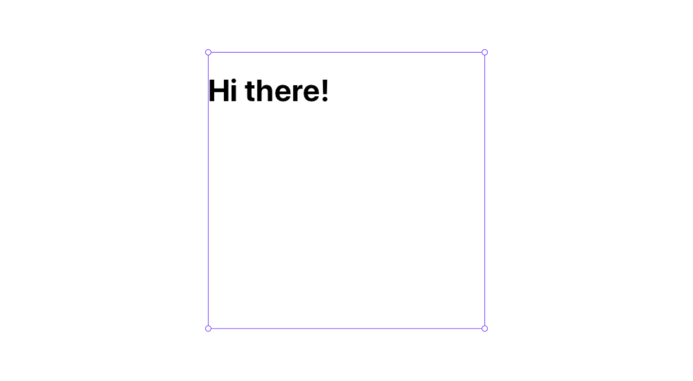
Learn how to build React components for use in Framer projects.
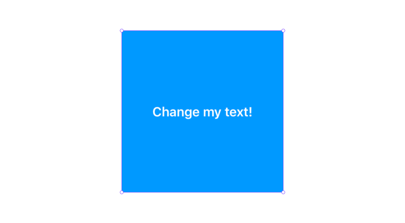
import { addPropertyControls, ControlType } from "framer"

const myStyle: React.CSSProperties = {
    height: "100%",
    background: "#09f",
    // Text
    color: "White",
    fontSize: 16,
    fontWeight: 600,
    // Flexbox
    display: "flex",
    alignItems: "center",
    justifyContent: "center",
}

export default function My_first_component_06(props) {
    return <div style={myStyle}>{props.myText}</div>
}

My_first_component_06.defaultProps = {
    myText: "Change my text!",
}

addPropertyControls(My_first_component_06, {
    myText: {
        type: ControlType.String,
        title: "Text",
    },
})
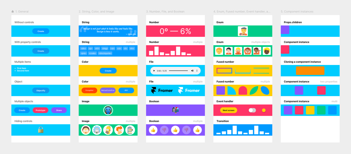
Property controls
That simple component above has a String property control, but there are other types: Color, Image, Number, File, Boolean, Enum, Fused number, Event handler, Transition, and Component instance. We look at examples for all of them.
Component styling
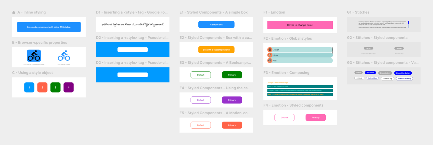
We look at the different ways of adding CSS styles to your components: Writing properties inline, putting them in an object, injecting CSS with a <style> tag, or using CSS-in-JS libraries like Styled Components, Emotion, and Stitches.
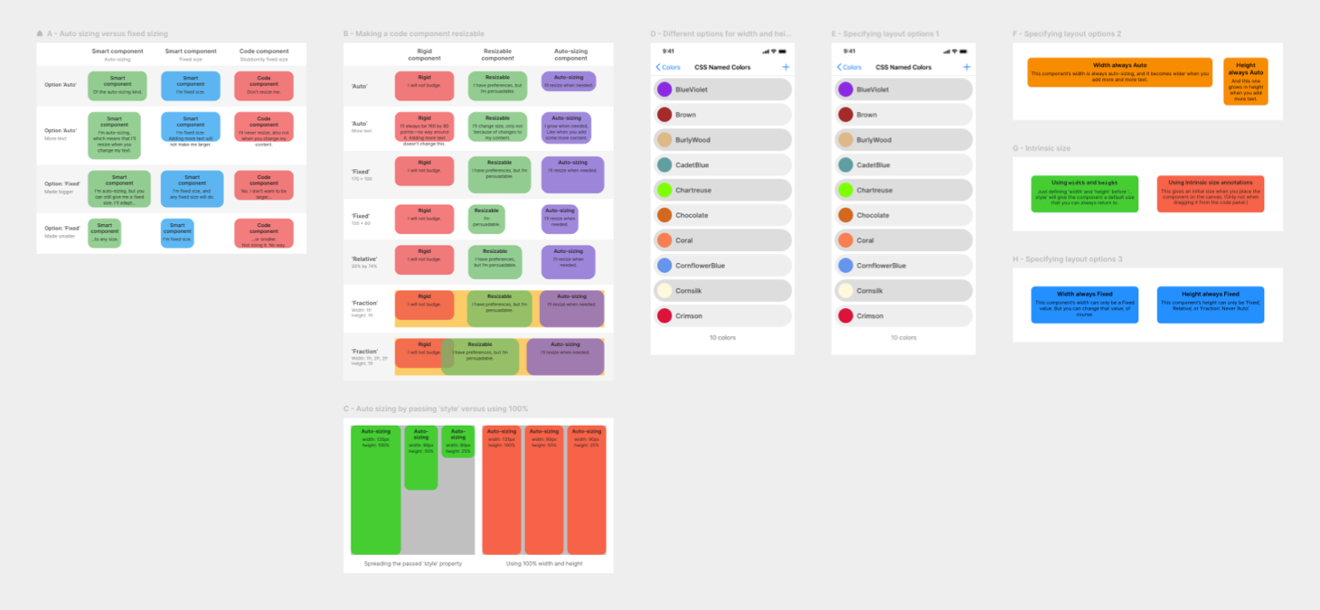
Component sizing
How to make your components resizable, work well with Framer’s auto-sizing, plus some mistakes you best avoid.
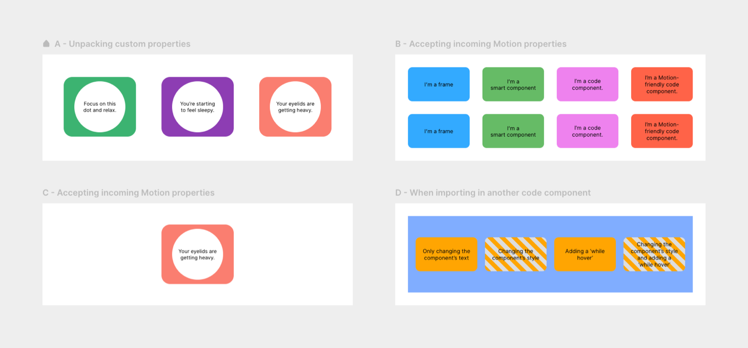
Motion-compatibility
Make your components react to Framer Motion properties. This way, they can be animated with an override and will respond to whileTap, whileHover, and other events.
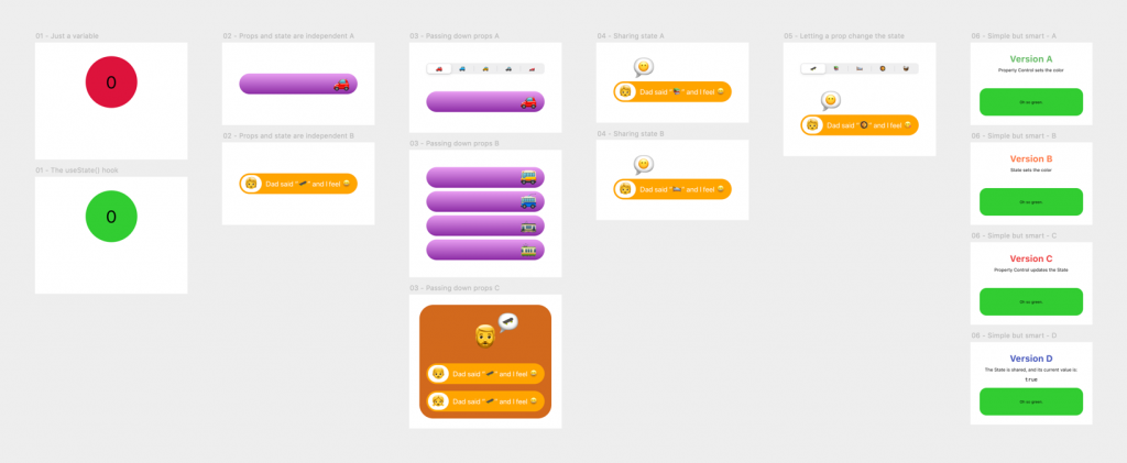
Make it smarter
In Smart Code Components, we let components share their internal state and react to property changes.
Importing other layers, components, and packages
You can enhance your code component by importing other components: canvas components, Framer’s built-in components, components from an existing design system, or a JavaScript library that offers extra functionality.
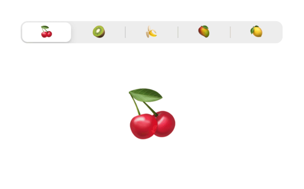
Importing Framer components
Using JavaScript, Framer’s Time & Date component will always show the current time (or date). I used it here in a recreation of the iOS status bar.
This iOS status bar component has a property control to let you select between Light and Dark modes. The reception, WiFi, and battery icons are SVGs in an (also imported) canvas component with ‘Light’ and ‘Dark’ variants.
Adding a JavaScript library
In this example, I imported the Lodash library of JavaScript utilities and used its flattenDeep() function to clean up a messy array.
Using components from an existing design system
Thanks to Framer’s possibility to import packages directly from NPM, you can reuse existing components. This is a bit more difficult because you might want to:
- Give a component Property Controls so that you can change how it looks directly in the Properties Panel
- Make it Motion-compatible (possible with the three design systems I tested)
MUI
I tried a few components from the main Material UI library:
- A Button (made Motion-compatible so that it works with, for instance, a
whileHover) - A Rating component
- Radio buttons
- A configurable Slider
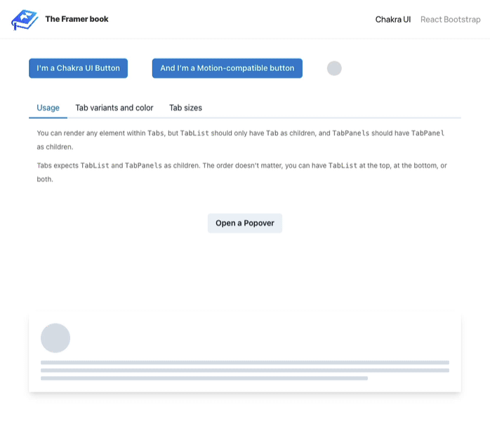
Chakra UI
And here are some example components from the Chakra UI library.
- A Button (also made Motion-compatible)
- A set of Tabs with content
- A Popover
- Bottom of the page: A set of ‘Skeleton’ components that have a ‘loading’ state

React Bootstrap
You probably know Bootstrap, a CSS toolkit to quickly build a website. Well, React Bootstrap is the same, but then as React components.
- A Button (you can make React Bootstrap’s components also Motion-compatible)
- A Modal that works with a full-page backdrop
- React Bootstrap’s Carousel component
A full-fledged code component
We apply the gathered knowledge by creating an iOS segmented control.
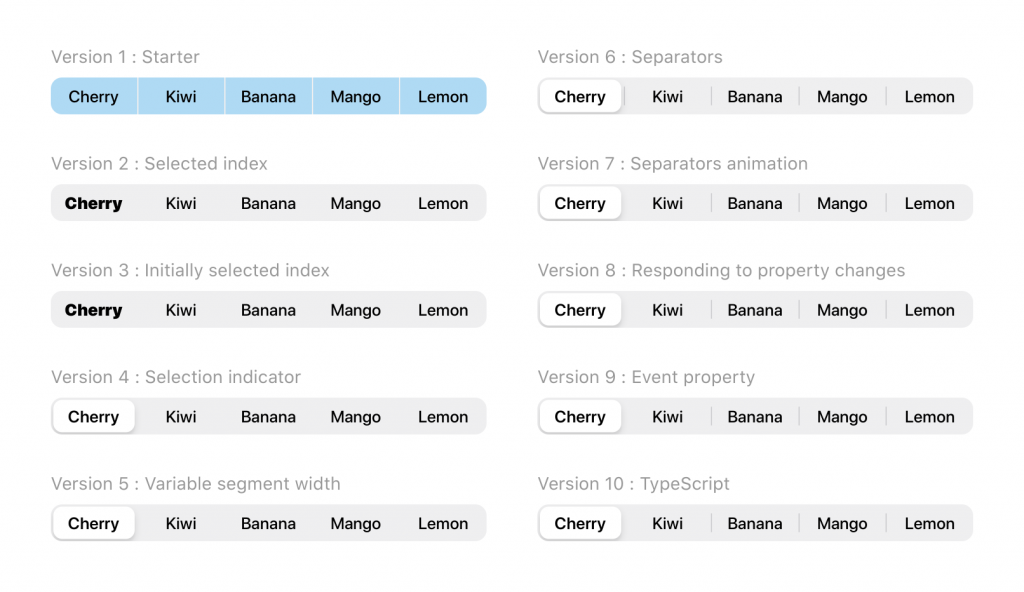
We build it step by step, adding state, animations, resizability, and even some TypeScript.
The finished component knows how to share its internal state (the selected segment).
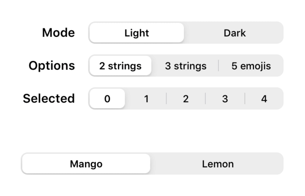
And we ensure that it responds to changes from the outside so that you can change its mode, options, and selected segment at any time.
Use it everywhere
You can use a versatile component like this in any prototype and add it to your Team Library.